
A simpler, stronger, and more enjoyable read logging experience.
This passion project began with my personal foray back into fiction and reading for fun. I love spending time browsing at libraries and bookstores. After a few months of reading a bunch of books and narrowing down my read preferences, I wanted a platform that was easy for me to browse like a library but with more in depth information and ratings on each book.
Enter Goodreads!
Goodreads launched in 2007 with a mission is to help readers discover books they love and get more out of reading. It was an effort to create a place for friends to discover and discuss good books together. It is currently the leading read logging app on the market. I love using Goodreads, however, there are some aspects of the app that could be improved.
After conducting user research and mapping the current app experience, three project goals took shape.
Project goals
-
The extensive app experience is burdened with an disorganized UI framework. The app lacks proper categorization of features and actions. This framework comes off as a “pile it on” mentality where new features weren’t properly evaluated and given a proper home. The app features need to be broken apart and put back together in a way that is user friendly and properly prioritized.
-
The UI is dated and needs to be updated to optimize the design output and usefulness of the app.
-
Many of the features are half baked or unfinished. There are a plethora of features that have intention but come up just short of their potential. These features either need to be cut or completed.
The process
User Research
Experience Mapping
Set Goals
Navigation & Feature Mapping
Wireframes
Rebrand
Designs & Prototyping
Experience
Mapping
A full audit of the existing platform was necessary in order to get a full understanding of Goodreads’ features, capabilities, and UI choices. I created and categorized a feature list and a screen flow. This information helped me understand feature organization while also cluing me into potential improvements (such as navigational redundancies). This is also where I start to notice opportunities in the framework to improve the existing features (such as kindle integration).
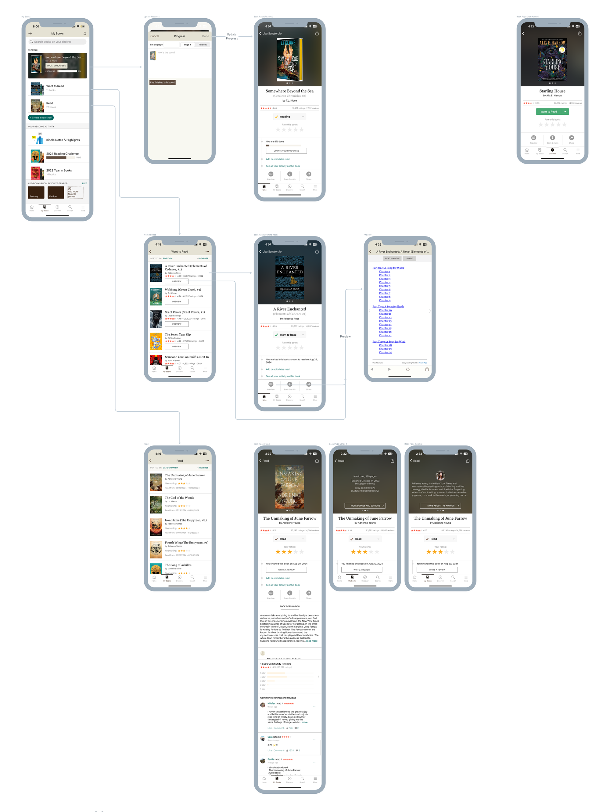
Navigation Mapping
In the old navigation, there were lots of features and pages accessible at a high level (crammed into the navigation bar). This style of content organization is exhaustive, but isn’t recommended for large feature sets or building depth in functionality.
My recommendation is to restructure the app to prioritize top actions and experiences that the user needs most often:
Updating Progress on a book
Exploring new books
Viewing Friends’ activity
Scanning books
Additionally, features should be accessible in the appropriate context. For example, I created “The Library” as a page that encompasses full exploration of new or recommended books. This helps build a space dedicated to that rather than exploration being spread across “Home”, “Discover”, “Search”, and some of the pages in “More”.

After rebranding, wireframes, and visual designs, the final product is a clean experience that allows the user to utilize the features that matter the most to them while also being able to efficiently explore and discover new reads in their library.


